Cityblock is a healthtech company that brings healthcare to the most underserved communities.
I was the Executive Director at Cityblock’s in-house marketing department.
Together with an incredible team of strategists, marketers, designers, and writers, we refreshed the brand from logo to voice, established our brand promise, and developed a multi-channeled engagement funnel.
“No one cares about you if you’re poor and not white.”
This was a statement we heard over and over again from our patients, or as we called them, members.
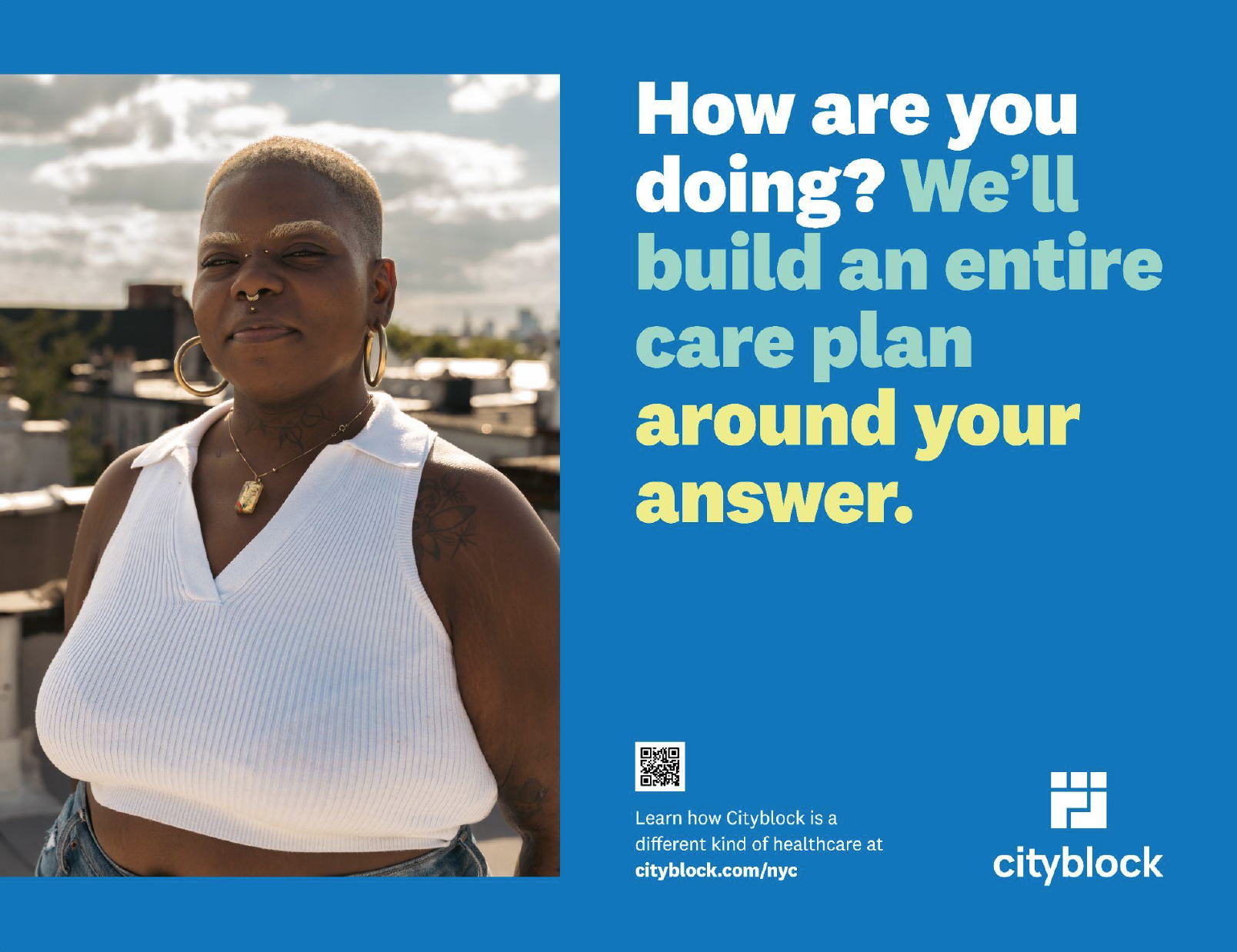
If you’re worried about where your next meal is coming from or having a safe place to live, the last thing on your mind is your blood pressure or taking care of your complex medical or mental health needs. Unfortunately, this disproportionately affects the BIPOC community, especially those with the fewest resources. Cityblock fills in the gaps of traditional healthcare by treating the whole person with an individualized care team – everything from medical needs, to finding a safe place to live, accessing fresh food, mental and behavior health services, as well as a dedicated person to help navigate the insanely complex healthcare system in the U.S.
“Why should I trust you?”
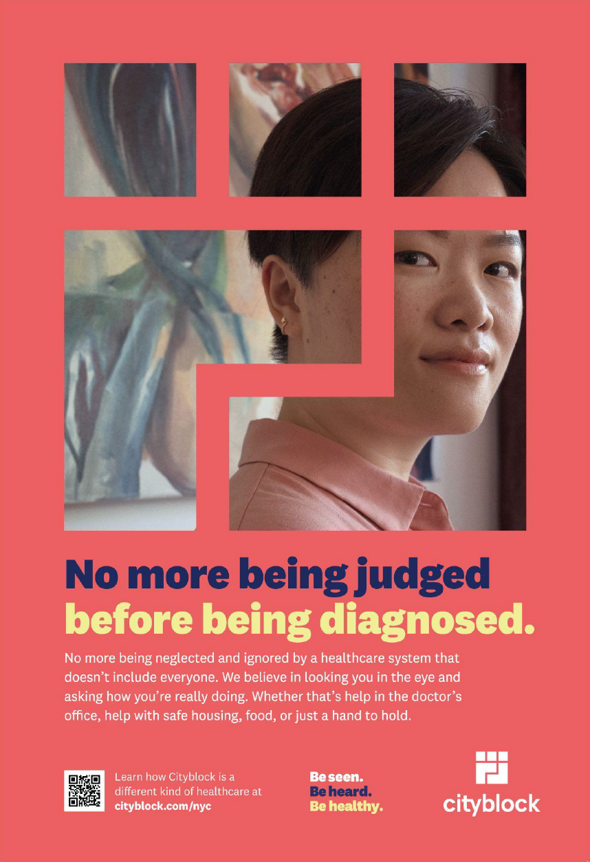
Our members have been burned by the traditional healthcare system; they felt discriminated against, ignored and neglected. They didn’t have any reason to trust us. Our first and most important job was to overcome their scam reflexes and earn their trust.
A brand as strong as our mission
Cityblock’s mission is to improve the health of marginalized communities as scale.
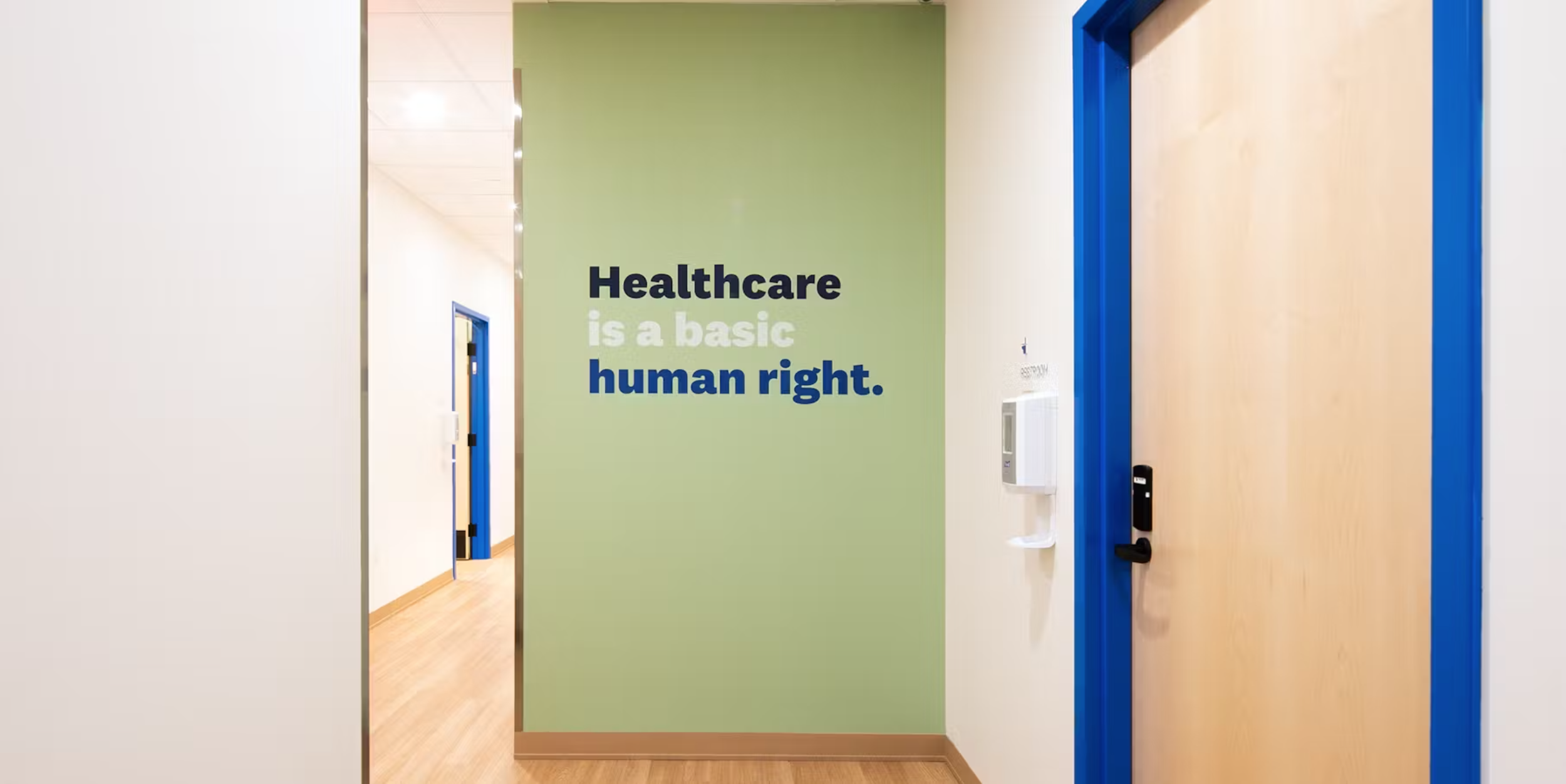
The brand promise to deliver Radically human healthcare is how that mission will be achieved. This was the brand strategy we put into place.
Everything we did, from the way our care teams provided care to the thinking behind our internal and external messaging stemmed from our brand promise.
The first thing we did was create a new visual and verbal identity that was audacious enough to live up to our mission and empathetic enough to live up to our members.
A hug? A fist? A city grid? Yes.
When the design team at Mackey Saturday first shared the logo, I saw a group of people hugging. Then a fist. Then a city grid from above. On another day, I see them in a different order. This mark that can flex between a hug, a fist, and a grid represents the three things that are the core of what Cityblock is about: empathy, audacity, and community. The ability to change between these three images also speaks to the different levers we pull daily to serve our members; sometimes it’s empathy above all else; sometimes it’s flexing our muscle of defiance, and at other times it’s tapping into the power of our community. But the one thing that never changes, regardless of the day or circumstance, is that one of them cannot exist without the others.
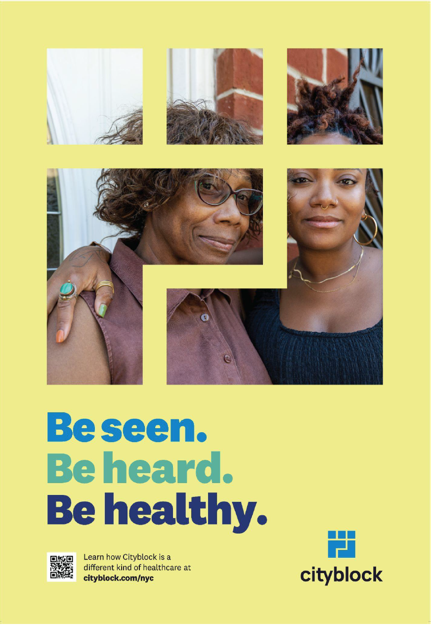
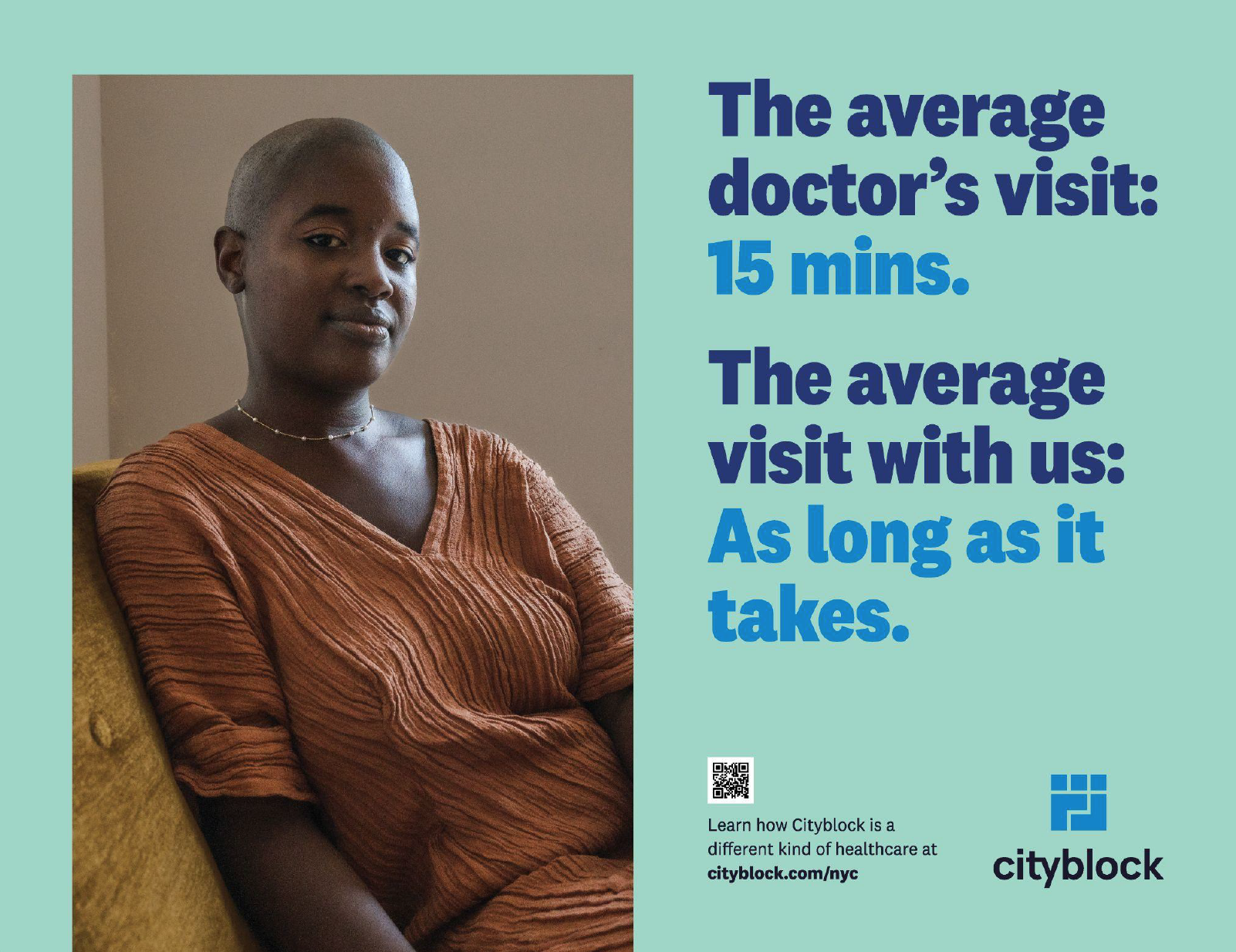
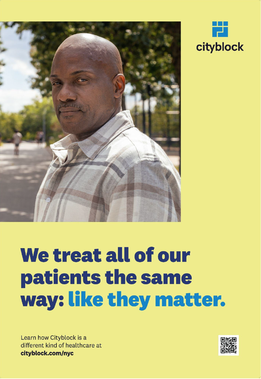
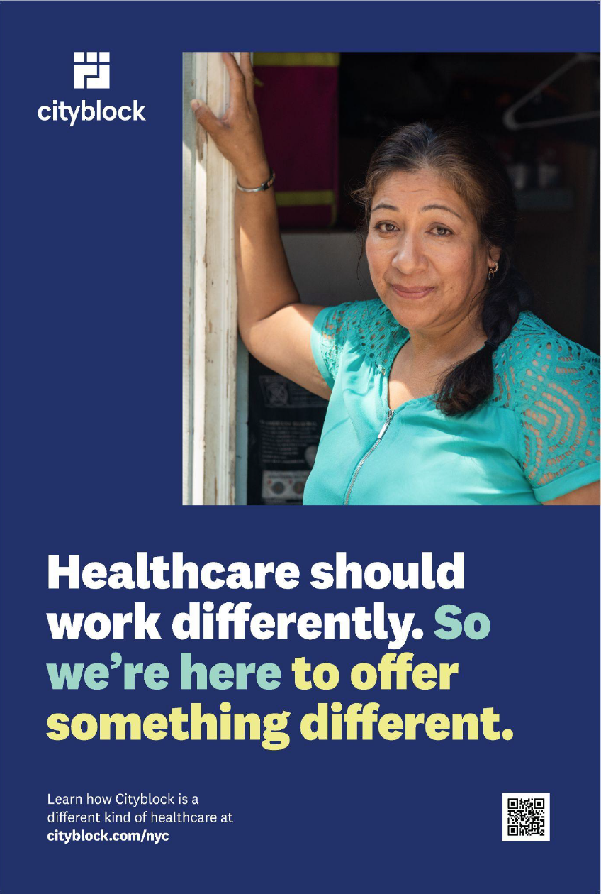
Everything about the brand’s visual identity – be it the colors, photography, illustration style, or the verbal identity reflects our ethos of compassionate care.
If you want to fully nerd out on the philosophy behind the rebrand, I break it down on Cityblock’s medium blog.
A space our community deserves
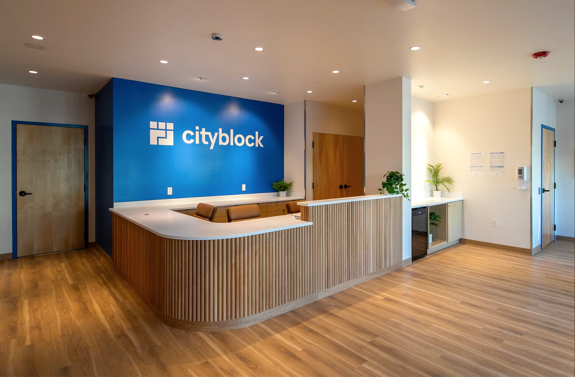
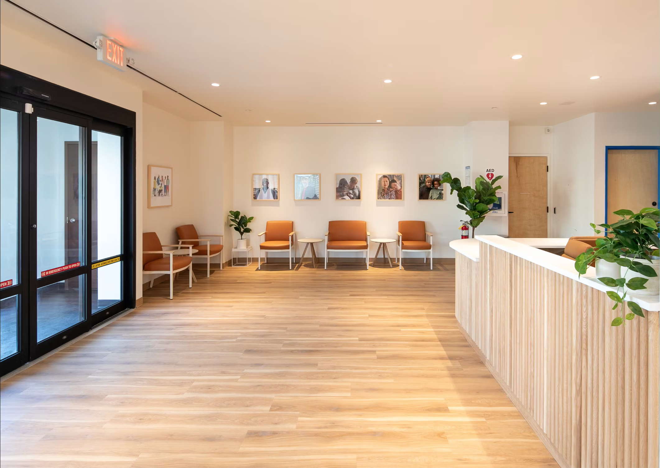
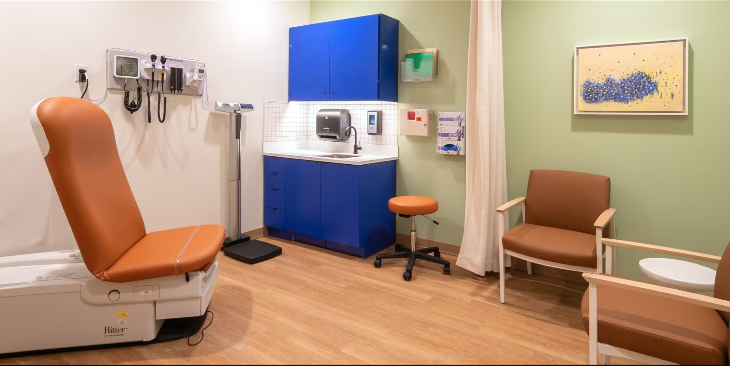
Not only did our brand have to look and sound like a different kind of healthcare to members but our clinics needed to make each patient feel like they mattered. Facilities with warm lighting, comfortable furniture selected for all body types and abilities, colors that felt soothing and welcoming – all of this is traditionally found in expensive concierge medicine like One Medical or Dntl Bar. Places like this doesn’t exist for the underserved population who often used the ER as their primary form of care.
Cityblock hubs change that.


